 Also, Helvetica.
Showing posts with label illustration. Show all posts
Showing posts with label illustration. Show all posts
Wednesday, June 16, 2010
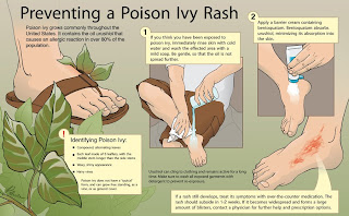
Posin' Ivy
I realized I hadn't posted this piece at all when I originally made it. It's from class I had last fall about learning how to use Adobe Illustrator. It's inked, colored, and laid-out in Illustrator, after scanning in hand-drawn pencil drawings. The image depicts a simple first aid procedure about how to treat poison ivy (besides praying for it to go away quickly). That's really all there is to say about it; it's a pretty simple way to get acquainted with the program.
 Also, Helvetica.
Also, Helvetica.

Friday, April 30, 2010
Think Floyd
My Editorial class is winding down, and I'm getting close to resolving the journal cover I've chosen to create for it. For the assignment, we searched through various journals, or thought up topics of interest, and chose one that interested us. I chose synaesthesia, which is a topic that has always interested me. Synaesthesia is a condition in a small group of people in which one sensation being triggered (in the example below, sound) automatically triggers another secondary sensation (color, below) at the same time. I think it's a really fascinating neurological condition, but I don't want to get into that here.
After going through several (very different) iterations, I ended up with the image below. I've always liked the iconography of Pink Floyd's "Dark Side of the Moon" album cover, and I was really happy to work with it. I put this into a cover template that I re-created in Adobe Illustrator of the journal Neuron.

I started the piece by painting it in oil paint on a 22"x28" canvas board. Then I photographed that in with a high-resolution digital SLR and digitally airbrushed it a bunch until I got it close to how I wanted it to look. What's uploaded above is not my final version, but I really wanted to upload something new, so I'll just replace it with the next version after I have gone through my critique and modify it.
After going through several (very different) iterations, I ended up with the image below. I've always liked the iconography of Pink Floyd's "Dark Side of the Moon" album cover, and I was really happy to work with it. I put this into a cover template that I re-created in Adobe Illustrator of the journal Neuron.

I started the piece by painting it in oil paint on a 22"x28" canvas board. Then I photographed that in with a high-resolution digital SLR and digitally airbrushed it a bunch until I got it close to how I wanted it to look. What's uploaded above is not my final version, but I really wanted to upload something new, so I'll just replace it with the next version after I have gone through my critique and modify it.
Wednesday, February 17, 2010
Pen & Ink
I just finished up my Pen and Ink class a little while ago, so here are some of the pieces that came from that:
The first assignment (to be added as soon as I scan it) was to get used to working with flexible-nib pens. The goal was to draw and ink on scratchboard, an image of our hand holding some sort of object. I chose a corn cob because I thought it would be fun to draw. It was, mostly, but got kind of tedious doing each kernel after a while.

The next assignment was to translate an existing tone illustration (we were assigned charcoal and graphite, fully-rendered pictures from old anatomy textbooks) into pen and ink. So that's what I did. I'll post a comparison shot of the original soon, because they are actual pretty different.
 The last, and major, assignment for the course was to take an existing anatomy sketch that we had drawn from a cadaver during a previous course, and to use that as a basis to make an anatomical illustration. This is of the internal anatomy of a kidney, which was based on an earlier sketch, but completely re-drawn in a different perspective and cleaned up to make it look more consistent and normal. I wanted to draw it bisected, then opened up like a book, with ureter on one side and vasculature on the other.
 This was actually done with Micron pens rather than flexible-nib, mostly in the interest of saving time. Both this and the one above were done on translucent vellum.
The first assignment (to be added as soon as I scan it) was to get used to working with flexible-nib pens. The goal was to draw and ink on scratchboard, an image of our hand holding some sort of object. I chose a corn cob because I thought it would be fun to draw. It was, mostly, but got kind of tedious doing each kernel after a while.

The next assignment was to translate an existing tone illustration (we were assigned charcoal and graphite, fully-rendered pictures from old anatomy textbooks) into pen and ink. So that's what I did. I'll post a comparison shot of the original soon, because they are actual pretty different.
 The last, and major, assignment for the course was to take an existing anatomy sketch that we had drawn from a cadaver during a previous course, and to use that as a basis to make an anatomical illustration. This is of the internal anatomy of a kidney, which was based on an earlier sketch, but completely re-drawn in a different perspective and cleaned up to make it look more consistent and normal. I wanted to draw it bisected, then opened up like a book, with ureter on one side and vasculature on the other.
 This was actually done with Micron pens rather than flexible-nib, mostly in the interest of saving time. Both this and the one above were done on translucent vellum.
Tuesday, February 16, 2010
cephaloPod
It's been a while since I've posted anything new, so I thought I'd update with some recent work.
This piece was the result of a project from two classes: a tone drawing class, and an introductory class to illustration with Adobe Photoshop. The goal was to find and teach something, such as interesting anatomy or behavior, on a plant or animal of our choice, in the form of an informational poster or something similar. The first half of the project was to create the base illustration using graphite. In my case, that is the large squid in the top-right of the layout. The second half was to place that image within a layout that involves the necessary text and insets to explain the idea behind the illustration. To get us used to illustrating in Photoshop, we were supposed to render any additional images to look as if they were done with the traditional media (graphite) used for the main drawing.

I chose to do a piece on how squids (and by extension the other cephalopods) propel themselves through the water. To supplement my library research, I ordered a preserved squid online to dissect, and I bought a ton of fresh squid from Asian food superstore H-Mart, which had me constantly wanting to eat fried calamari. It was an interesting project to do, but as with anything, when it's all said and done I can see a bunch of things I would do differently a second time around. Still, it was a fun piece to do for my first real illustration.
This piece was the result of a project from two classes: a tone drawing class, and an introductory class to illustration with Adobe Photoshop. The goal was to find and teach something, such as interesting anatomy or behavior, on a plant or animal of our choice, in the form of an informational poster or something similar. The first half of the project was to create the base illustration using graphite. In my case, that is the large squid in the top-right of the layout. The second half was to place that image within a layout that involves the necessary text and insets to explain the idea behind the illustration. To get us used to illustrating in Photoshop, we were supposed to render any additional images to look as if they were done with the traditional media (graphite) used for the main drawing.

I chose to do a piece on how squids (and by extension the other cephalopods) propel themselves through the water. To supplement my library research, I ordered a preserved squid online to dissect, and I bought a ton of fresh squid from Asian food superstore H-Mart, which had me constantly wanting to eat fried calamari. It was an interesting project to do, but as with anything, when it's all said and done I can see a bunch of things I would do differently a second time around. Still, it was a fun piece to do for my first real illustration.
Subscribe to:
Posts (Atom)