Tuesday, November 2, 2010

3Delayed

So it's been a long time since I've updated this. It's not like I haven't been busy. I actually have a bunch of things I could get up here, and I eventually will.

Anyways, here are a couple things from my 3D illustration/animation class. I took the course this summer, but just recently finished it up 'officially'. The 3D modeling was done with 3D Studio Max 2010, combination with Discovery Studio Visualizer, which helped convert protein structure data into a basic scaffold to then use in 3DS Max. Post-production for stills was done in Adobe Photoshop, and for the animation in Photoshop and Adobe After Effects (still stuck on CS4 for both).
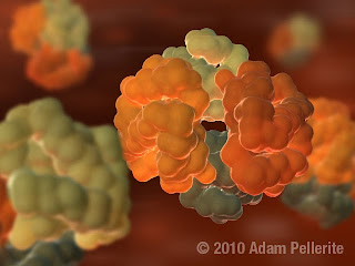


Hemoglobin! Hand-delivers us oxygen all day every day. With a smile. This still image was done for an early class assignment, when learning to export Protein Database models to 3DS Max for manipulation. It was really just a chance to play around with lighting in 3D and other effects in Photoshop to put together a finished image.
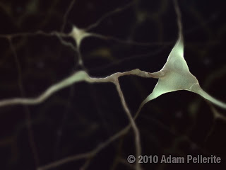


This was for a later assignment where we followed a set of instructions to learn how to manipulate basic shapes into more complex ones. In this case the example was a basic neuron. So the underlying model is technically made by me, but following a specific set of instructions. Where I had my own control was in the placement and look of the dendrites and axons of the nerve. Post-production again done in Photoshop. I would like to re-do this with a more realistic neuron model in the future, but it was fun to learn on.


The final project for the class was a short, simple 3D animated educational video about a protein of our choice. I chose the Arp2/3 protein complex, and animated it in this extremely simplified video. The idea was that I wanted it to be a (fake) part in a series of AP Biology level high school animations that might accompany a textbook. What I have here is actually not the most final version, but I will upload that when I am able. It's basically the same, with only a few minor tweaks. I don't know how I feel about the video. I learned quite a bit making it, but if I did it again I would have done it totally differently. And much better. But it was a fun learning exercise. Models/cameras were done in 3D Studio Max, post-production art in Photoshop, and video editing/compositing done with After Effects.

That's my update for today. I will update more often in the future, along with retroactively getting up some stuff from the past few months too.
Wednesday, June 16, 2010

Posin' Ivy

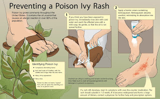
I realized I hadn't posted this piece at all when I originally made it. It's from class I had last fall about learning how to use Adobe Illustrator. It's inked, colored, and laid-out in Illustrator, after scanning in hand-drawn pencil drawings. The image depicts a simple first aid procedure about how to treat poison ivy (besides praying for it to go away quickly). That's really all there is to say about it; it's a pretty simple way to get acquainted with the program.


Also, Helvetica.

Friday, April 30, 2010

Think Floyd

My Editorial class is winding down, and I'm getting close to resolving the journal cover I've chosen to create for it. For the assignment, we searched through various journals, or thought up topics of interest, and chose one that interested us. I chose synaesthesia, which is a topic that has always interested me. Synaesthesia is a condition in a small group of people in which one sensation being triggered (in the example below, sound) automatically triggers another secondary sensation (color, below) at the same time. I think it's a really fascinating neurological condition, but I don't want to get into that here.

After going through several (very different) iterations, I ended up with the image below. I've always liked the iconography of Pink Floyd's "Dark Side of the Moon" album cover, and I was really happy to work with it. I put this into a cover template that I re-created in Adobe Illustrator of the journal Neuron.


I started the piece by painting it in oil paint on a 22"x28" canvas board. Then I photographed that in with a high-resolution digital SLR and digitally airbrushed it a bunch until I got it close to how I wanted it to look. What's uploaded above is not my final version, but I really wanted to upload something new, so I'll just replace it with the next version after I have gone through my critique and modify it.

Wednesday, April 28, 2010

I found some old sketches

I'll hopefully have some new work to put up soon, but in the mean time I found a few old pen and marker sketches from undergrad, when I was going through otherwise empty sketch books. I really need to use markers again, they are really fun.


After having brought around a sketchbook/journal for my spring break in Spain in 2008, and doing several drawings per day in it, I decided I wanted to do the same when I went to Nice for a the weekend. Unfortunately, this is the only sketch I got around to doing. It's of Plage Mala, the first beach of the weekend. For full immersion, play "Hips Don't Lie" by Shakira on repeat for hours, because that's what the boat in the corner was doing. The sketch was done in micron pigment pens.


I probably drew toward at the end of sophomore year, in the spring of 2007. Possibly early junior year. It was in an old sketchbook I used for notes in an anatomy drawing class. Basically just a few quick marker sketches at the outside (read: free) part of the Boston Aquarium. Done with micron pigment pens and gray Prismacolor markers of varying opacity.


This was done around the same time as the previous sketch. It's from some random day when I was walking around Boston and decided to draw a duck from the Public Garden.

I'm not claiming these are great sketches, but I'm always excited when I find old sketches, and wanted to post something.

Friday, March 26, 2010

If I drank coffee it would be out of an 'Ugly Mug'

So in the cold cold month of February I had my several week '3-D/Sculpture' class. It was supposed to end in the middle of last month, but (again) because of the massive snowstorm we got here in Baltimore, the finishing touches were delayed a month. Essentially the class was about getting exposure to working with three dimensional media for medical topics.


The first project was very similar to one I had in undergrad, which was to make a plaster cast of my face. In this case, I made a patina that is supposed to resemble oxidized copper, even though the piece itself is cast in gypsum. I had to remodel my nostrils, part of my lower lip, and my eyebrows with metal carving tools and drills, because they were not cast as perfectly as they should have.


The main bulk of this class was to create either a medical model or a prosthetic (my professor for this course is an Anaplastologist in my department). I chose to make a nasal prosthetic, because I was really interested in the process, having never seen it done before. I won't go into much detail, but basically the final prosthesis I made is a modification of my own nose to fit a hypothetical "patient" model who is missing one for one reason or another. The prosthetic is made of several layers of colored, translucent silicone, with extrinsic coloring on top as well to match the skin tone of the "patient". If this were to be for a real person, adhesive would be spread around the paper thin edges and it would fit snugly against the patient's skin so that is was almost imperceptible to a random passerby. I am generally happy with how the prosthetic came out, and have definitely learned a whole bunch from the experience.

Sunday, March 21, 2010

Digital Love

Hey everyone. I realized that I'm going to be starting some new projects soon, which means I won't have anything substantial to update for a little bit, so I wanted to get something up in the meantime.


This is a digital painting, done in Adobe Photoshop CS4. It was practice for a larger assignment that will be posted in the near future. The whole point was to get used to Photoshop as a painting medium, and to accurately reproduce an autopsy photograph, particularly different tissue types and realistic colors. It really is that colorful inside the human body. So, that's all this assignment was, really. Mindless fun, no instruction or teaching purpose, just practice.

Wednesday, February 17, 2010

Water ... and colors ... together?

I just started my watercolor class last week. The first assignment was to get used to painting with watercolors (I have never done a serious watercolor painting before). We had to pick a plant and paint it. At the supermarket I picked up the last remaining tomatillo in the cleaned-out produce section the night before the first crazy Baltimore snowstorm 2 weekends ago.


There's not much to say about it ... it's a tomatillo!

Pen & Ink

I just finished up my Pen and Ink class a little while ago, so here are some of the pieces that came from that:

The first assignment (to be added as soon as I scan it) was to get used to working with flexible-nib pens. The goal was to draw and ink on scratchboard, an image of our hand holding some sort of object. I chose a corn cob because I thought it would be fun to draw. It was, mostly, but got kind of tedious doing each kernel after a while.


The next assignment was to translate an existing tone illustration (we were assigned charcoal and graphite, fully-rendered pictures from old anatomy textbooks) into pen and ink. So that's what I did. I'll post a comparison shot of the original soon, because they are actual pretty different.

The last, and major, assignment for the course was to take an existing anatomy sketch that we had drawn from a cadaver during a previous course, and to use that as a basis to make an anatomical illustration. This is of the internal anatomy of a kidney, which was based on an earlier sketch, but completely re-drawn in a different perspective and cleaned up to make it look more consistent and normal. I wanted to draw it bisected, then opened up like a book, with ureter on one side and vasculature on the other.

This was actually done with Micron pens rather than flexible-nib, mostly in the interest of saving time. Both this and the one above were done on translucent vellum.

Tuesday, February 16, 2010

Photography, or: I should stop doing projects about delicious seafood

This is where I put up some of the pictures I took in my photography class.

The main project was to again make a teaching piece about a plant or animal specimen of our choice, by taking the necessary pictures, researching, and creating the appropriate layout. Seeing as I had some white shrimp in my refrigerator (and they are interesting to look at), I decided to do my piece about shrimp anatomy.


Taking the photos for this was fun. My professor had a ton of different lighting set-ups for us to use. To take this, I ended up submerging the shrimp underwater in a flat-bottomed glass bowl, to eliminate any out-of-water reflection due to it being wet. The bowl was placed on a sheet of glass raised about a 4-5 inches above black velvet (which was to absorb light below the shrimp). For the actual light, I used a set-up of four surrounding LED lights on the end of flexible necks. With two of them I pointed up at the shrimp from below the glass platform, to back-light the carapace and legs. The other two I pointed obliquely across the top of the shrimp to catch some of the features facing the camera. It took a bit of set-up and test photos, but the pictures came out incredibly clear and I am very happy with them. They were then put into a layout in which I tried to show most of the shrimp's general surface anatomy.

That was the "teaching" portion, but there were many other assignments for the class as well. Some of them are portraits that I won't put up for privacy reasons, but here are some others from the class. They were mainly for experimenting with our cameras and getting used to photography in general.

Black-and-White conversion:
Boring? I can buy that. But it was great really finding out and playing with how to digitally convert color photos to black-and-white and avoiding the "Convert to grayscale" option, which is horrible. This was taken at the Cylburn Arboretum in Baltimore.


Sculpture photography:
The idea was to take 3 outdoor photos of a sculpture to be theoretically used to present or promote the sculpture by whatever institution it belongs to. These are 3 (of many more I took) of a 1906 bronze piece by Emile-Antoine Bourdelle titled, "Fruit."


Architecture:
These were taken when I did a half-day rotation in the Hopkins photography department. Architecture photography wasn't an assignment, but it happened to be what I helped do during the rotation. These were really fun to take, because I got to crawl all over the hospital rooftops to get them. 3 are of the construction of the new wing of the hospital, and one is of part of Baltimore's harbor.


The panoramas were stitched together from 3 and 4 shots, respectively.

cephaloPod

It's been a while since I've posted anything new, so I thought I'd update with some recent work.

This piece was the result of a project from two classes: a tone drawing class, and an introductory class to illustration with Adobe Photoshop. The goal was to find and teach something, such as interesting anatomy or behavior, on a plant or animal of our choice, in the form of an informational poster or something similar. The first half of the project was to create the base illustration using graphite. In my case, that is the large squid in the top-right of the layout. The second half was to place that image within a layout that involves the necessary text and insets to explain the idea behind the illustration. To get us used to illustrating in Photoshop, we were supposed to render any additional images to look as if they were done with the traditional media (graphite) used for the main drawing.


I chose to do a piece on how squids (and by extension the other cephalopods) propel themselves through the water. To supplement my library research, I ordered a preserved squid online to dissect, and I bought a ton of fresh squid from Asian food superstore H-Mart, which had me constantly wanting to eat fried calamari. It was an interesting project to do, but as with anything, when it's all said and done I can see a bunch of things I would do differently a second time around. Still, it was a fun piece to do for my first real illustration.